
Quick answer
What visual aids are and when to use them
Visual aids are slides, charts, graphs, photos, props, videos, handouts, or demonstrations that help the audience understand your message. Use them when they make an idea easier to see, compare, remember, or believe.
- Use one main idea per slide or visual.
- Avoid reading the visual word for word.
- Make charts, images, and props large enough to understand in a few seconds.
A visual aid is anything the audience looks at to understand a spoken point: a slide, photo, chart, diagram, map, prop, demonstration, short video, whiteboard sketch, or handout. The best visual aid makes one idea easier to see. It does not duplicate the speaker's script.
If you are deciding what to use, begin with the job the visual must do. Choose a chart to compare values, a diagram to explain a process, a photo to show something concrete, or a prop when size, shape, and physical detail matter.
Visual aid example: the same data, a clearer message
These original example slides use fictional response-time data, not Orai or customer results. Both show January through June values of 12, 10, 9, 6, 5, and 4 minutes. The redesign changes the explanation, not the numbers.
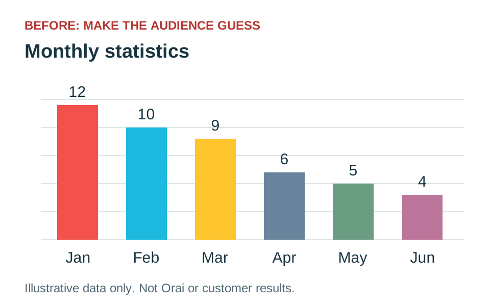
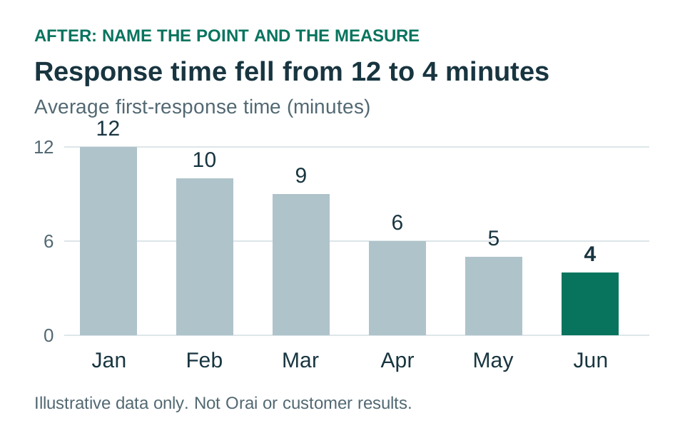
What to say: “This chart shows average first-response time from January to June. It fell from 12 minutes to 4. The chart alone doesn't tell us why, so our next step is to examine what changed during that period.”
Use this approach when your audience needs to compare results. Keep the full dataset or additional measures available separately, label real data with its source and time period, and avoid claiming that a workflow change caused an improvement unless your evidence supports that conclusion. Rehearse the spoken explanation, not just the slide, with the speech timer.
Types of visual aids with examples
| Visual aid | Use it to | Example | Avoid it when |
|---|---|---|---|
| Slides | Structure key ideas and display supporting visuals | A single takeaway with one relevant image | The slide would only repeat your spoken sentences |
| Charts and graphs | Compare quantities, trends, or proportions | A line chart showing change over five years | The audience cannot read the labels quickly |
| Diagrams | Explain relationships, systems, or sequences | A simple flow from customer request to delivery | The diagram needs a long legend to make sense |
| Photos | Show a person, place, condition, or before-and-after result | A close image of storm damage | The image is decorative rather than informative |
| Maps | Show location, movement, scale, or geographic patterns | A route with three decision points highlighted | Unnecessary detail hides the location you mean |
| Props and models | Make physical size, shape, or operation tangible | A product prototype the audience can inspect | The object is too small for the room to see |
| Demonstrations | Show how an action or process works | Completing one step while explaining it | Setup time or failure risk overwhelms the lesson |
| Video | Show movement, behavior, or a place you cannot reproduce live | A 20-second clip of a machine operating | The clip is long enough to take over the presentation |
| Whiteboards and flip charts | Build an idea with the audience in real time | Drawing a decision tree during discussion | Your handwriting or room setup makes it hard to follow |
| Handouts | Provide detail people need during or after the talk | A one-page checklist or reference table | Reading the handout would distract from the speaker |
How to choose the right visual aid
Match the visual to the communication task, not to the software you already opened. Ask what would remain difficult if the audience only heard your words.
- To compare: use a bar chart, small table, or paired before-and-after images.
- To show change: use a line chart, timeline, sequence, or repeated image from consistent viewpoints.
- To explain a process: use a diagram, live demonstration, annotated photo, or short video.
- To establish location: use a simplified map with the relevant area emphasized.
- To make an abstract idea concrete: use an analogy, prop, model, or one representative example.
- To support a decision: show the few criteria, tradeoffs, or outcomes the audience must evaluate.
A presentation does not become clearer merely because it has more visuals. If the audience can understand the point just as quickly from one spoken sentence, leave the visual out.
Seven rules for effective presentation visuals
- Give each visual one job. A slide can introduce a question, show evidence, or summarize a decision. Asking it to do all three creates competition.
- Design for the farthest viewer. Test type, labels, and important details at the actual display size. A chart that is readable on a laptop may fail in a room.
- Remove everything that does not support the spoken point. Extra icons, gridlines, labels, colors, and animation consume attention.
- Direct attention deliberately. Tell the audience what they are looking at before interpreting it: “Focus on the change after April.”
- Keep speaking to people. Glance at the visual only to orient yourself. Face the audience for the explanation.
- Make the visual accessible. Use strong contrast, readable type, color plus labels, captions for meaningful video, and a spoken description of essential images.
- Rehearse the exact transition. Practice when the visual appears, what you say first, where you stand, and how you move on.
How to simplify a chart or data slide
Start by writing the conclusion in one sentence. Then keep only the data needed to support that sentence. Highlight the series, date, or comparison you will discuss and reduce the visual weight of everything else.
Before
“This chart contains monthly results for six departments across three years.”
After
Headline: Customer response time improved after the April workflow change.
Visual: Highlight the response-time line and April marker; mute unrelated series.
Spoken cue: “Look at the blue line after April. The improvement is sustained for five consecutive months.”
Use a descriptive headline instead of a generic label such as “Results” or “Q3 Data.” The headline should state what the audience is meant to notice, while the speaker explains why it matters and any important limitations.
Visual aid examples for different presentations
Class presentation
A timeline for historical events, one labeled diagram for a scientific process, and a short source list at the end.
Business update
A dashboard reduced to three decision metrics, followed by a slide naming owners and next steps.
Sales presentation
A product demonstration, one customer workflow, and a comparison limited to criteria the buyer actually values.
Research talk
A method diagram, clearly labeled results, and a final visual separating conclusions from limitations.
Training session
A live demonstration supported by a handout people can use when they repeat the task later.
Virtual presentation
Large, high-contrast visuals designed for small screens, with captions and links shared separately in chat.
How to present a visual without reading it
Introduce the visual, pause long enough for the audience to orient itself, direct attention to the relevant part, and then interpret it. A useful sequence is: what it is, where to look, what it means, and why it matters.
For example: “This map shows commute times by neighborhood. Focus on the three darkest areas on the east side. Each is more than forty minutes from the nearest major employment center, which is why the proposed route begins there.”
Once the point is complete, move to the next visual or remove the prop from view. Leaving an old visual on screen invites the audience to keep processing it while you discuss something else.
Watch: choosing a useful visual aid
In this short Orai video, Danish Dhamani explains practical visual-aid options and how they affect a presentation.
Common visual-aid mistakes
- Using paragraphs as slides. The audience cannot read and listen to different language at the same time.
- Decorating instead of explaining. A stock photo that adds no information still consumes attention.
- Showing raw data. Select the comparison that supports the point and provide full detail separately.
- Depending on color alone. Add direct labels, symbols, patterns, or annotations.
- Starting a video without context. Tell people what to watch for before pressing play.
- Distributing a dense handout too early. Share it after the explanation unless people need it to participate.
- Assuming the equipment will work. Test connections, sound, playback, clickers, and an offline backup.
- Apologizing for a crowded slide. If you know it is hard to read, redesign it before presenting.
Visual-aid checklist before you present
- Every visual supports one spoken point.
- Text and labels are readable from the back of the room or on a phone-sized video window.
- Charts identify units, time periods, sources, and the comparison that matters.
- Images have permission or appropriate licensing and meaningful sources are credited.
- Video and audio clips are short, cued, captioned, and tested.
- Color is not the only way important information is distinguished.
- You know the sentence that introduces and closes each visual.
- A backup exists for any technology-dependent demonstration.
Plan your visuals alongside the presentation outline, not after the script is finished. Then rehearse with the real slides, props, and clips. Use the speech timer to account for pauses and demonstrations, and practice in Orai to check that your pace and transitions still sound natural.
Frequently asked questions
What are visual aids in presentations?
Visual aids are supporting materials such as slides, charts, images, props, handouts, or demonstrations that help the audience understand your message.
What are examples of visual aids?
Common visual aid examples include slides, diagrams, charts, graphs, photos, videos, physical props, whiteboard sketches, and handouts.
What types of visual aids work best for speeches?
The best type depends on the point: use charts for comparisons, photos for concrete examples, props for demonstrations, and simple slides for structure or emphasis.
Why are visual aids important?
Visual aids make information easier to process and remember, especially when the speaker uses them to clarify rather than replace the spoken explanation.
What is the biggest mistake with visual aids?
The biggest mistake is making the visual too crowded or reading directly from it instead of speaking to the audience.